The Grid Before the Screen
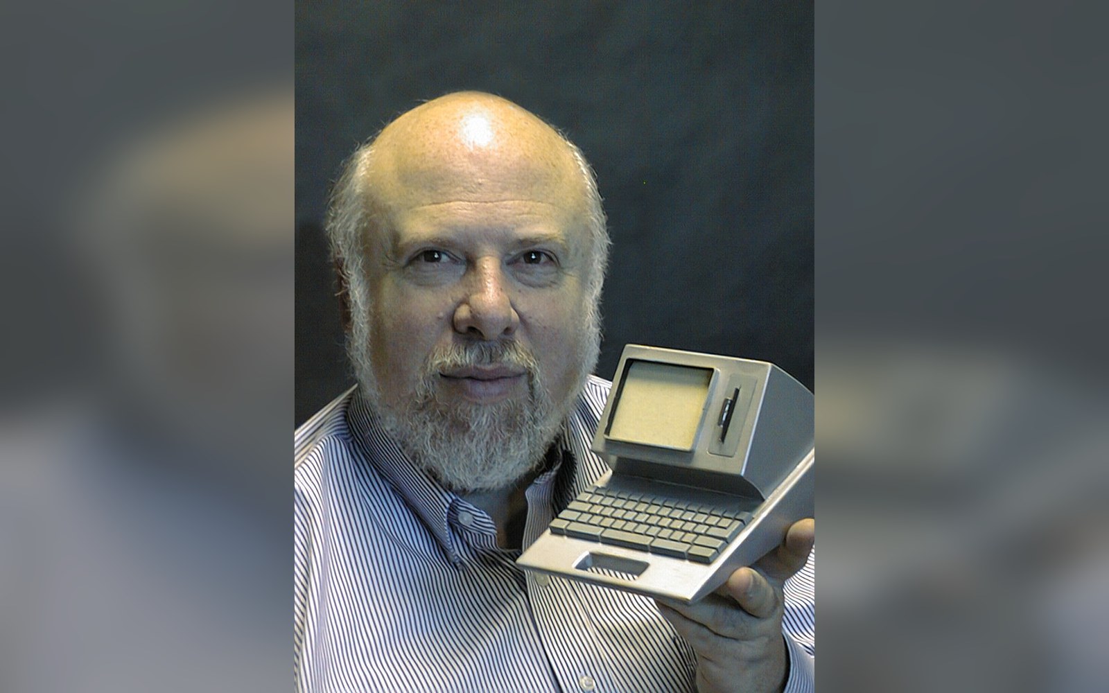
Susan Kare arrived at Apple in 1983, recruited to the Macintosh team by her friend Andy Hertzfeld. She had a fine-arts background — a doctorate in sculpture from New York University — and no prior software experience. That combination turned out to be exactly what the machine needed.
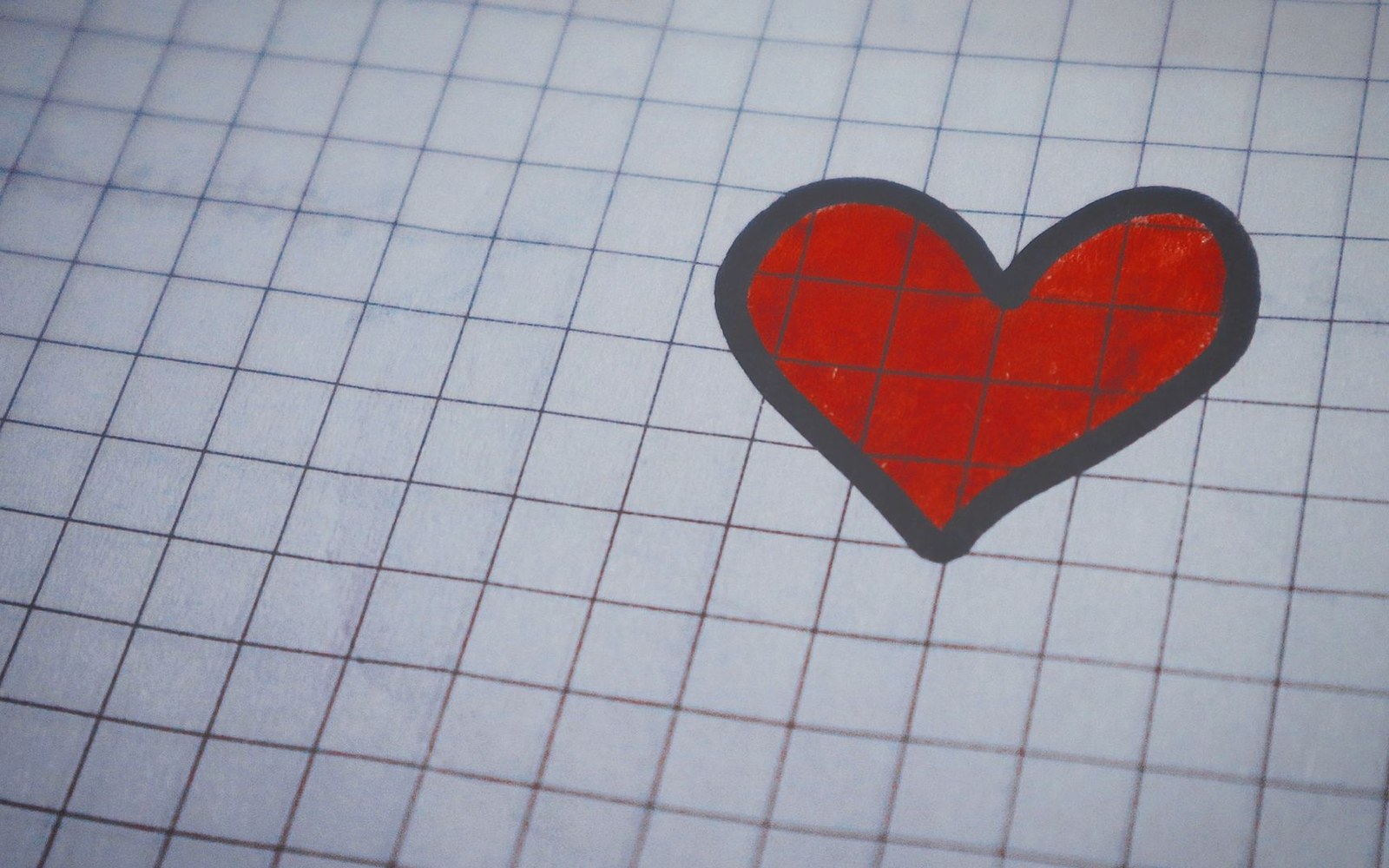
The Macintosh operated at 72 dots per inch, and its icons lived inside a 32-by-32-pixel grid. Kare’s method was analogue before it was digital: she worked out her designs on graph paper ↗, treating each small square as a single pixel, then transferred the patterns to screen. The constraint was severe, and she embraced it as a sculptor would — form emerging from limitation.
The most consequential image she drew in that grid was the Happy Mac: a smiling face inside a compact computer silhouette, displayed at startup to confirm that the system had passed its self-test. Kare gave the face a smile, and the choice was deliberate. It was a greeting, not merely a status indicator. From the moment a user switched the machine on, the computer was already a character with a disposition.
Chicago, Geneva, and the Typeface Question
Kare also designed the original Macintosh bitmap typefaces, naming them after cities: Chicago, Geneva, Monaco, Cairo, Athens, San Francisco. Chicago became the system font — readable at small sizes, structured without being cold. The city-naming convention was her own and stuck through several generations of Apple software. Chicago remained the primary Macintosh interface font for over a decade before being retired in favour of Charcoal with Mac OS 8 in 1997.
The typefaces were inseparable from the icon work. Both had to function at sizes where individual pixels were visible and meaningful. A serif that looked elegant at 72 points became a smear at 12; Kare designed from the small size outward, which reversed the usual graphic-design workflow of the era.
- Happy Mac — the smiling startup icon; Kare’s first and most culturally durable image for the Mac
- Chicago — the bitmap system typeface Kare designed; named for a city, remained primary Mac font until 1997
- 32 × 32 pixel grid — the dimension constraint within which every original Mac icon was designed
- Graph-paper originals — Kare’s analogue method: each square on paper = one pixel on screen
What the Icons Said About the Audience
The Finder icons — the file folder, the trash can, the clipboard — drew on the visual language of an office desktop, the metaphor that the team had inherited from research at Xerox PARC. Kare’s contribution was not the metaphor itself but its execution at human scale: images recognisable to someone who had never used a computer and did not intend to learn one in the academic sense.
That decision had an explicit audience in mind. Jobs’s stated goal for the Macintosh, repeated through the development period and at the Flint Center introduction on January 24, 1984 ↗, was a computer for the rest of us — a formulation that required the machine to feel approachable on first encounter, before any instruction. Kare’s icons were the first things users saw and touched, literally: the Macintosh mouse directed a cursor toward her drawings. The face that appeared at startup and the trash can that swallowed unwanted files carried the whole conceptual weight of that approachability claim.
From the moment a user switched the machine on, the computer was already a character with a disposition.
She has described the design process in later interviews as thinking about what objects people already recognised, then asking what the minimum number of pixels needed to make that recognition happen actually was. The answer was often fewer than expected.
After the Mac
Kare left Apple in 1985 when Jobs departed, joining him at NeXT as creative director. She later designed icons for Microsoft Windows 3.0 and for Facebook’s early gift application, accumulating a body of work that spans four decades and touches most of the major personal-computing interfaces. Her work has since been widely recognised with major design honours.
The graph-paper originals surfaced publicly over the years in exhibitions and in Kare’s own archival presentations. They remain among the clearest illustrations of how the Macintosh’s famous friendliness was not a marketing position added afterward — it was drawn into the machine one pixel at a time, by hand, before the machine existed.
- 1983Kare joins the Macintosh team at Apple
- January 24, 1984Macintosh introduced at the Flint Center; Kare’s icons appear publicly for the first time
- 1985Kare leaves Apple with Jobs; joins NeXT as creative director
- 1989–90designs icons for Microsoft Windows 3.0
- 1997Chicago retired as Mac system font with Mac OS 8
- 2019named Apple Design Award honouree